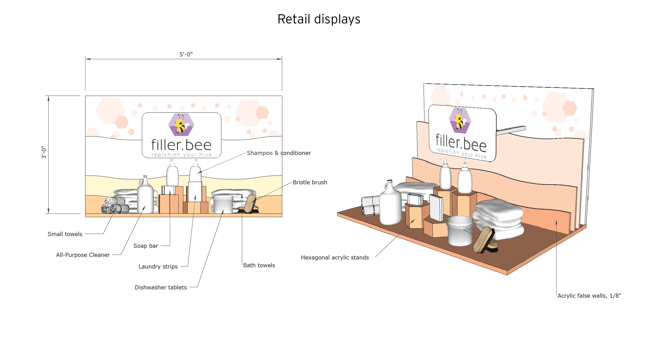
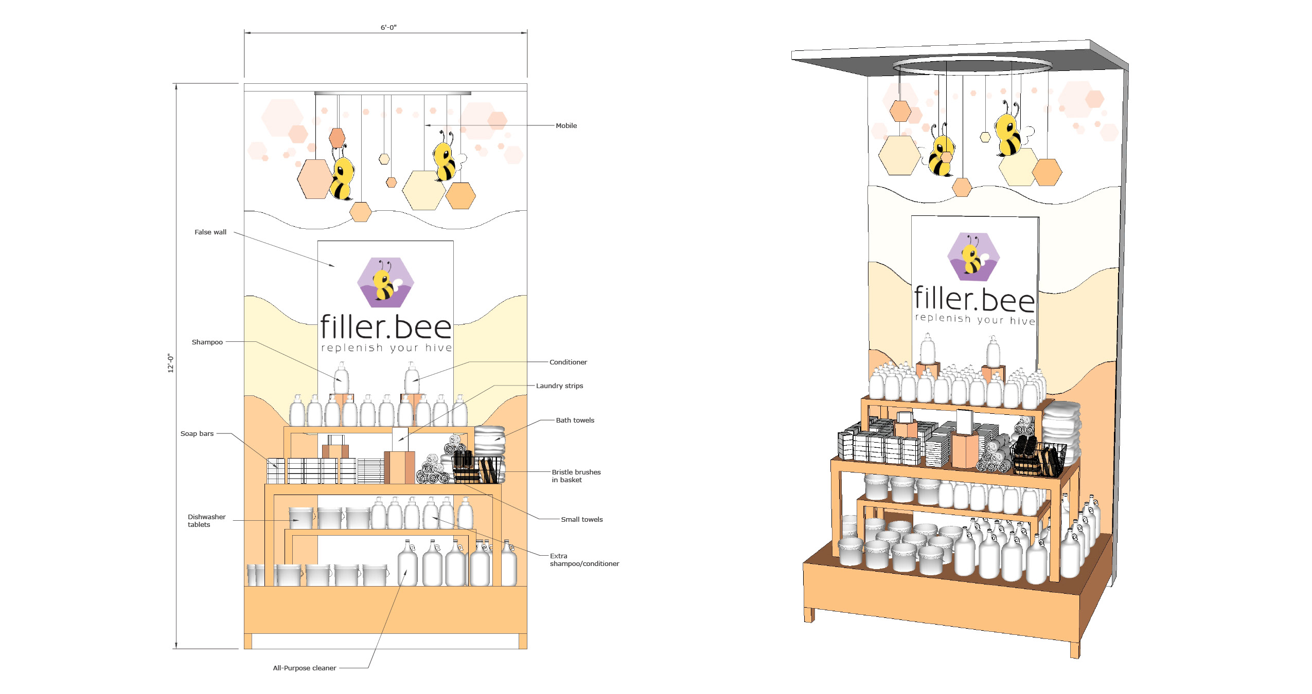
filler.bee Soap Brand
Project type: Branding + Visual Merchandising
Objective: Design an upscale zero-waste soap brand, including brand standards, product labels, and retail displays.
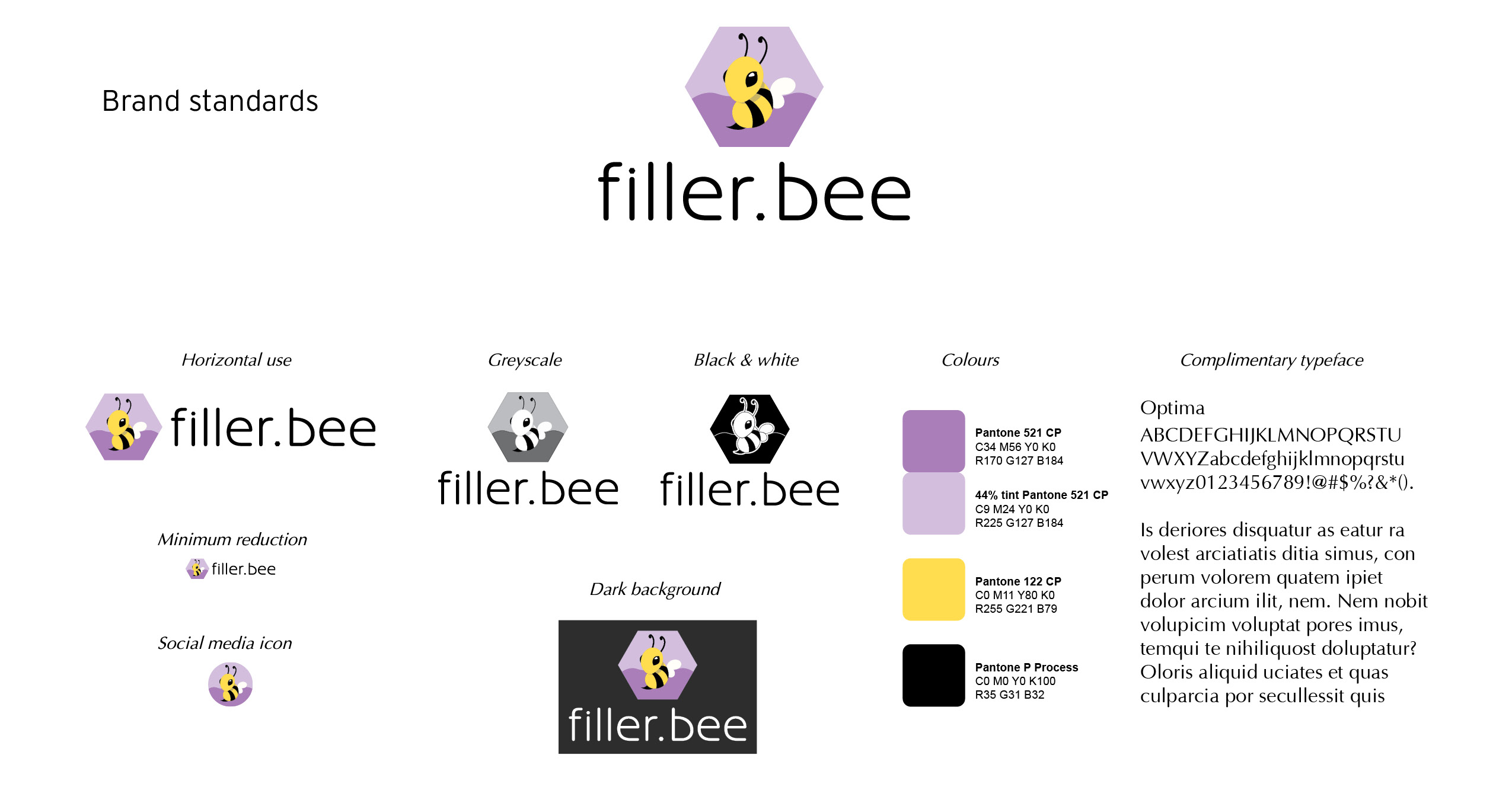
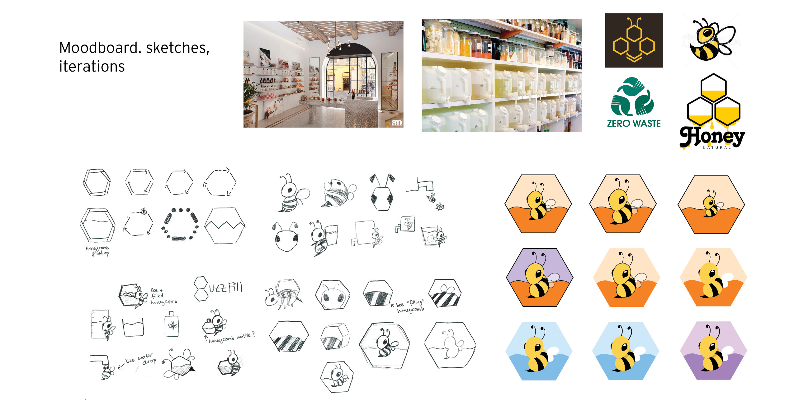
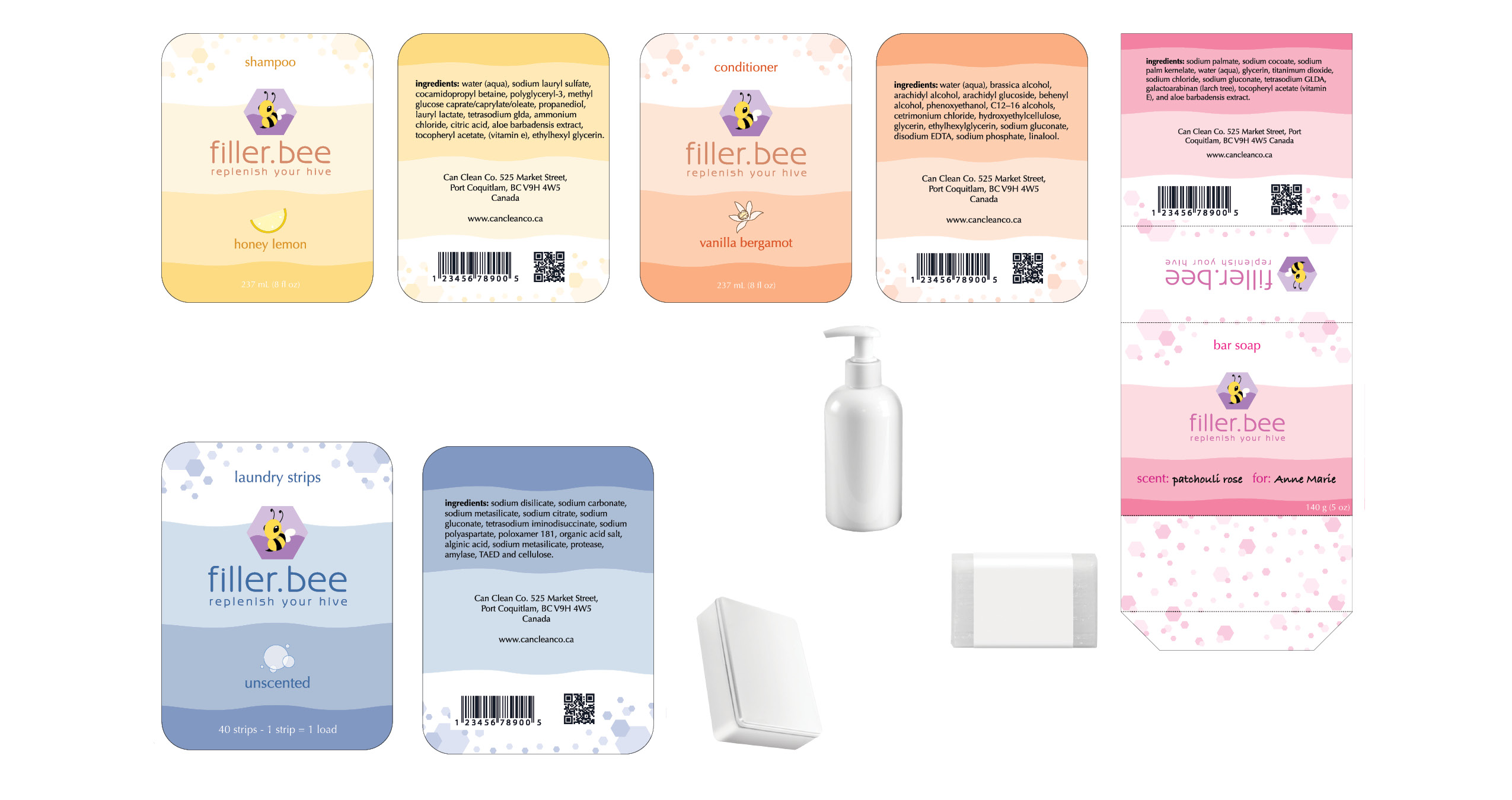
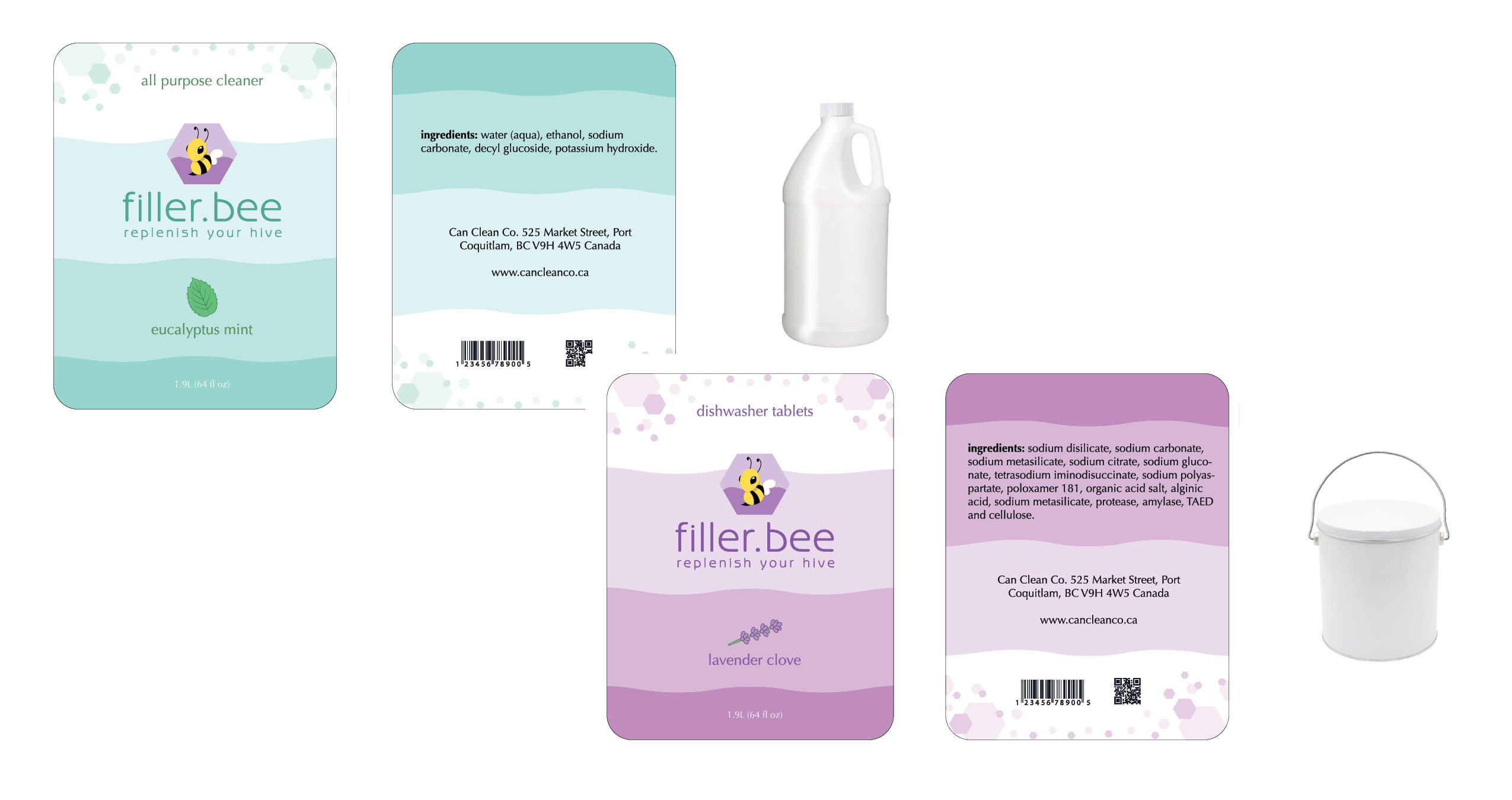
Solution: When brainstorming brand names, I first thought of "buzzfill", a play on the word "buzzkill", since customers would be able to refill their containers at the store. I later settled on "filler bee" (a play on killer bee), since it rolled off the tongue more easily. The logo features a hexagon that is half-filled with liquid, a reference to the brand's refilling concept. Product labels also feature hexagonal soap bubbles, in line with the bee theme.
Brand Statement
Efficient | Modern | Luxury
We are a company that prioritizes customer delight
and satisfaction. We hope to bring a luxury experience
to the world of zero-waste living, and to attract
customers that might not always have the time to
clean and gather their empty containers to refill
them in a retail store.
The store will provide a delivery service, either
through a one-time fee for single deliveries, or
a subscription fee with a delivery schedule specified
by the customer. Filled product containers are
delivered, and empty containers (if any) are taken
back by the store, cleaned, and prepared for resale.
Customers are also encouraged to bring their own
reusable containers, and can receive free labelling
stickers for this purpose.
